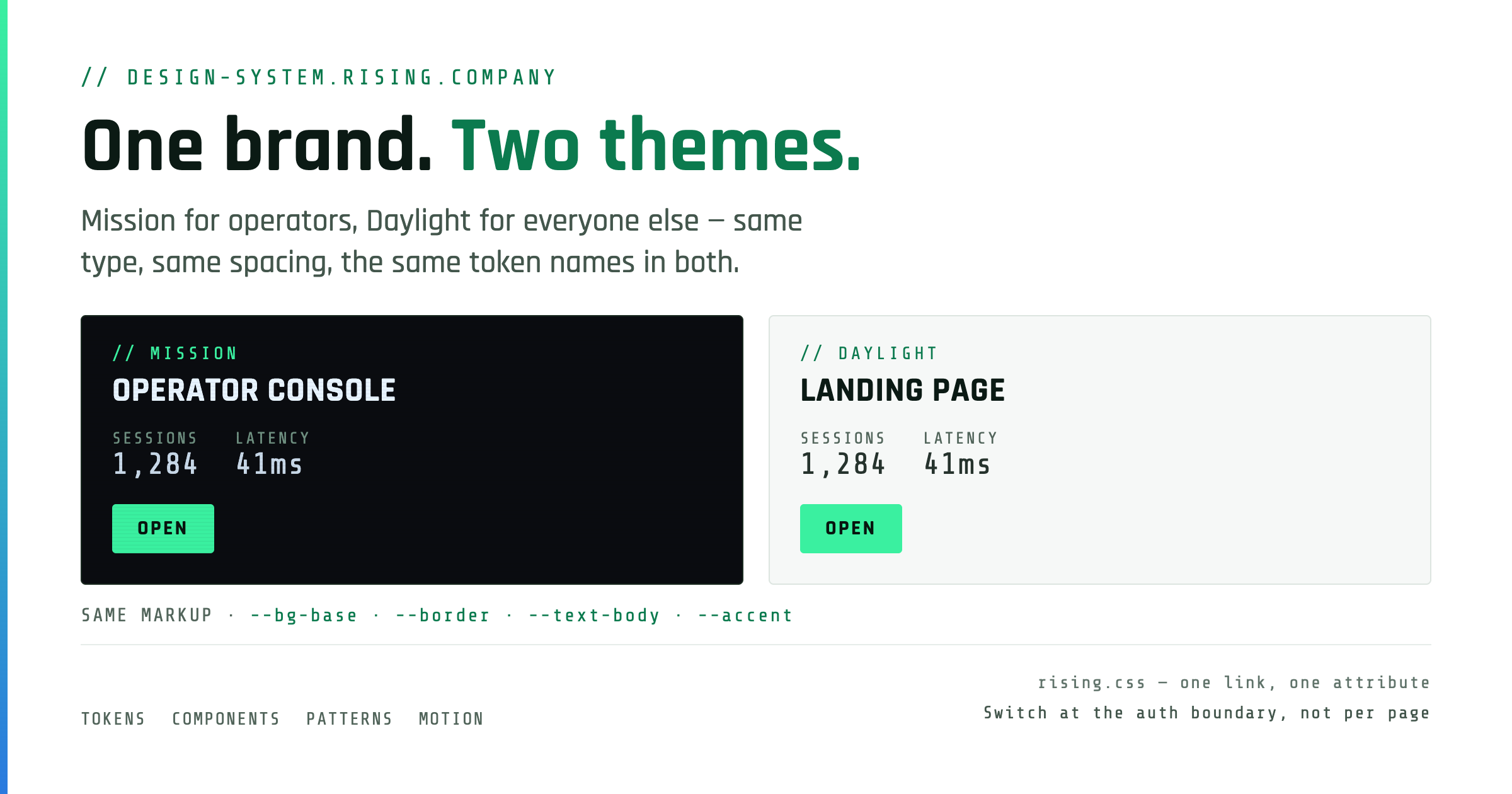
One brand, two themes. Same type pairing, same spacing, same voice, same token names —
only the palette and the amount of chrome change. A product picks a theme and commits to it;
it is a product decision, not a viewer preference.
// Mission · Daylight — the same card, both themes
Mission
Operator-facing
Consoles, dashboards, diagram and map views, admin, always-on displays, low-light rooms. Scanlines and corner brackets on.
Landing and marketing pages · onboarding · sign-in for people who aren’t staff · forms and data entry · docs · anything shown in a bright room
// Rules
Stranger test
If a stranger sees it first, it’s Daylight. A cold visitor should not be met with a black screen and a bare input — sign-in is the end of a landing page, not a substitute for one.
Switch at the auth boundary
A product may ship both: Daylight for its public surface, Mission for the app behind the login. Switch once, at sign-in — never per-page.
One-way opt-in
A Daylight product may offer Mission as an opt-in dark mode. A Mission product must not silently flip to Daylight.
Chrome is theme-conditional
Scanlines, corner brackets and the atmosphere grid are Mission-only. Daylight carries the brand through mono labels, the // prefix, the mint and the spacing — not through darkness.
// Applying a theme
<htmldata-theme="daylight">/* mission is the default when the attribute is absent */:root, [data-theme="mission"] { --bg-base: #0a0c10; /* … */ }
[data-theme="daylight"] { --bg-base: #f6f8f7; /* … */ }
02
Color
Both themes expose the same variable names, so components are written once. Reference the
variable, never the literal hex.
// Backgrounds
Token
Mission
Daylight
Use
--bg-base
#0a0c10
#f6f8f7
page background
--bg-surface
#0d1117
#ffffff
cards · panels
--bg-surface-hover
#0f1520
#eef3f0
interactive hover
--bg-inset
#0a1410
#e8f5ee
badges · recessed areas
// Borders
Token
Mission
Daylight
Use
--border
#1a2a20
#dde5e0
card borders · dividers
--border-hover
#2a4a38
#9dc4b0
card hover border
--border-subtle
#1a3020
#e6ede9
badge borders · faint rules
--border-grid
#111820
#e9efeb
background structure
// Text
Token
Mission
Daylight
Use
--text-heading
#e8f4ff
#0b1a14
page & card titles
--text-body
#c8d8e8
#26332d
primary body text
--text-muted
#84a89a
#43564c
descriptions
--text-subtle
#7d9b8c
#4a5d54
subtitles · mono metadata
--text-label
#6e8f80
#52655b
section labels · placeholders
--text-dim
#61856d
#61746b
footer chrome — decorative only
// Accents
Token
Mission
Daylight
Use
--accent
#3af0a0
#3af0a0
brand fill — button/badge background
--accent-hover
#6ff7be
#22dc8c
--accent under hover — keeps --accent-on text
--accent-ink
#3af0a0
#0b7a4e
accent as text · icon · border
--accent-on
#08150f
#08150f
text on top of --accent
--accent-2-ink
#2a7adf
#1f5fbf
secondary accent
--danger-ink
#ff4a24
#c02a10
error · destructive
--warning-ink
#f5b83d
#8a5a00
warning · caution
// Derivatives
Token
Mission
Daylight
Use
--accent-wash
#3af0a014
#0b7a4e12
selected / active wash — @ 8%
--accent-line
#3af0a050
#0b7a4e45
accent border — @ 31%
--accent-bracket
#3af0a040
#0b7a4e30
corner brackets — @ 25%
// Contrast — both ramps hit the same rungs (ratio vs. --bg-base)
Token
Mission
Daylight
Verdict
--text-heading
17.5 : 1
16.8 : 1
AAA
--text-body
13.5 : 1
12.4 : 1
AAA
--text-muted
7.5 : 1
7.4 : 1
AAA
--text-subtle
6.5 : 1
6.6 : 1
AA+
--text-label
5.5 : 1
5.8 : 1
AA
--text-dim
4.6 : 1
4.7 : 1
AA — lowest rung, still legible
--accent-ink
13.2 : 1
5.0 : 1
AA
// Two traps
--accent is a fill, not an ink
Mint #3af0a0 is 1.4:1 on white. In Daylight use it as a button or badge background with --accent-on text. For accent text, icons and 1px borders use --accent-ink, which darkens to #0b7a4e.
every rung clears AA, --text-dim included
Almost everything on the bottom three rungs is 12px Share Tech Mono, whose hairline stems go grey on a 1× display. Contrast is what buys them back, so nothing sits under 4.5:1. --text-dim is still the lowest rung — footer chrome and the backlink, never a form placeholder. Use --text-label for that.
The state recipe applied to --danger-ink. Outline at rest, fills on hover.
Sizes
btn-lg for hero CTAs, btn-sm for nav and table rows.
Disabled
No new colors — drops to the low-emphasis ramp: --text-label on --border-subtle.
// Form fields
We’ll email you a sign-in link. No password to remember.
Not a valid address.
Locked to your organisation.
// Field rules
16px inputs, always
Anything smaller triggers zoom-on-focus in mobile Safari. Field text is Rajdhani 16px / 500 even though the label above it is 12px mono.
Placeholders use --text-label
Never --text-dim. A placeholder people can’t read is worse than no placeholder.
Labels carry the // prefix
A field label is system commentary, same as a section label. // Email, not Email.
Help text is a sentence
Chrome is terse; anything a stranger reads is plain English. Help and error copy are written for humans, not operators.
06
Patterns
Page-level compositions. A user-facing product needs a landing page before it needs a login
box, and every product needs the same chrome once someone is signed in — these are the shapes that keep showing up.
.app-bar (brand · nav · session) → .app-main with one .page-header → .app-footer (ident · links · backlink). Moving between products should feel like moving between rooms of one building.
Chrome is surface, content is base
Bar and footer sit on --bg-surface; the view sits on --bg-base. That one-step lift is the whole hierarchy — no shadows, no heavier borders. 56px bar, 16px footer, both full-bleed.
One user menu, top-right
Initials chip + email opens a panel: who you are, the account items, then Sign out last — ruled off, --danger-ink on hover. Same order in every product. Status stays outside; it’s system state, not user state.
Not the landing nav
.nav is 64px on --bg-base with a CTA. .app-bar is 56px on --bg-surface with none, and the mark replaces the // Rising eyebrow. Switch at the auth boundary, with the theme.
The way home
by rising.company sits 12px after the wordmark and is the link back — same tab, every product, always there. The brand itself goes to the product’s home, never to Rising. .app-context is only for a real tenant or environment.
// App shell — sidebar product, and the one mobile form
Below 768px every product wears the same chrome: brand + session on row one, then the nav as a 44px touch row that scrolls under the gutters with a fade at each edge. A sidebar product hides its sidebar and renders that same bar — modules become the nav row, the org switcher moves into the user menu, build and backlink into the footer. No drawer, no hamburger.
// Empty state
No huddles yet
Create one and share the link — people mark their times without signing up.
Eyebrow → one-line explanation in --text-muted → one btn-secondary.
Centered, max-width 420px, 96px vertical padding. Never a bare “No results.”
// Link preview card — required of every product
The one page pattern nobody visits and everybody sees. A product travels by link, so the
card is its first impression more often than its home page is — and it earns that
by making the product’s argument out of the product’s own data, not by putting
a wordmark on a colored rectangle. 1200 × 630, Daylight always, shot at 2×.
Edge rule (the arrow’s gradient) → eyebrow // product.rising.company → headline with the decisive value in --accent-ink → one-sentence lede → the evidence band → footer rule with legend left, stamp right.
It has to read at 350px
Feeds downscale the card about 3×. Headline ≥ 48px, lede ≥ 24px, nothing mono under 14px, and no two states told apart by a hairline or a wash — --accent-wash disappears at that size.
Stamp the URL
Scrapers cache og:image by URL. A regenerated card behind an unchanged URL serves last month’s numbers for days — so the image carries ?v=YYYY-MM-DD, bumped in the commit that replaces the PNG.
Pin it with a test
A card built from product data goes stale the moment the data moves and nothing notices. Assert the numbers on the committed PNG against what the data now produces, and the stamp against the data’s timestamp.
07
Motion
Animation quality is the first priority of the design. Motion is the first thing a person feels on a screen and the first thing that reads as cheap when it is wrong — one mistimed panel undoes careful type and color in a single frame. So motion is designed, not added. Before an animation is written, answer what moves, why, how it enters, how it leaves, and what it does under reduced motion. No answer → no animation. A still view beats a careless one.
Everything beyond CSS hover and focus transitions is built on Motion — one engine, one set of curves, so every product moves the same way. Identical in Mission and Daylight.
// Library — motion.dev, required
// npm i motionimport { motion, AnimatePresence, MotionConfig, useReducedMotion } from"motion/react"import { animate, stagger } from"motion"// vanilla / non-React// wrap every React app root once — springs by default, reduced motion honoured
<MotionConfigreducedMotion="user"transition={{ type: "spring", visualDuration: 0.3, bounce: 0 }}>
No hand-rolled setTimeout / requestAnimationFrame / class-toggle choreography. No second engine (GSAP, react-spring, anime.js). Plain CSS transition stays for hover, focus and color.
// Scale — pick from it, never invent a value
Tier
Value
Use
Quick
0.2s ease · { duration: 0.2, ease: "easeOut" }
Hover, focus, color, border, opacity — the transition on every control
Base
spring · visualDuration 0.3 · bounce 0
Anything that moves or resizes: menus, panels, drawers, toasts, rows, layout changes
Whole surfaces: page reveal, route change, modal and scrim
Ambient
≥ 2.4s ease-out, looping
The status pulse — and nothing else
// Live — driven by Motion from the CDN
Panel · Base
Profile
Preferences
Sign out
Enters y 4 → 0, scale 0.98 → 1 from its anchor on the Base spring. Exits in 0.15s, fade-led. Toggle it mid-flight — it reverses from where it is.
Stagger · 60ms
Huddle · open
Venue · open
Safe · open
OS · open
Rows enter y 8 → 0 with opacity, 60ms apart, capped at eight. Past eight, batch — a 30-row table does not enter one row at a time.
Load Reveal · Slow
Sections rise 8px and fade in, 90ms stagger — the page you are reading booted like an instrument panel.
0.6s ease · one reveal per page · off under prefers-reduced-motion, content fully visible.
// Rules
Motion has a job
Reveal, confirm, orient or connect. Name the job in the code. If you can’t, cut the animation.
Transform & opacity only
x · y · scale · rotate · opacity. Never width, height, top, left, margin, padding, box-shadow or filter — size and position changes go through layout.
Never block input
Nothing waits on an animation; a user can click through a reveal. Nothing runs longer than Slow except the status pulse.
One entrance per view
The page reveals, or the panel opens — a section that is revealing does not also stagger the cards inside it.
Loops are for live state
The status dot pulses because the system is live. A skeleton may breathe on opacity. Nothing else loops, shimmers or spins.
Reduced motion is a state
Not a fallback. Transforms off, opacity kept, content at its final state. Verify with the OS setting on, not by assumption.
60fps on a 1× machine
Test with CPU throttling at 4×. If it drops frames, simplify — fewer elements, no blur, no layout on long lists.
Review it in motion
A screenshot cannot approve an animation. Watch entrance, exit, mid-flight interruption and reduced motion live before merging.
// Distances — small. Motion suggests where something came from; it does not travel there
Enter / reveal
y: 8 → 0 with opacity — sections, cards, toasts.
Menus · popovers
y: 4 → 0 · scale: 0.98 → 1, growing from their anchor via transformOrigin.
Exits
About 0.6× the entry, fade-led, inside AnimatePresence. Nothing pops out of existence.
Never
Scale from 0. Slide from off-screen unless it lives there (a drawer). Bounce — bounce: 0, always.
08
Effects & Interaction
Scanlines Mission only
Fixed overlay on every Mission page — --chrome-scanline lines, 4px rhythm. The token is transparent in Daylight, so the same rule goes inert. Shown exaggerated.
Corner Brackets Mission only
32px L-borders at viewport corners — --accent-bracket, 16px inset. Hidden in Daylight via --chrome-bracket-display.
Hover Gradient
2px --gradient bar at card top — opacity 0 → 1 on hover. Mint → blue in Mission, deep green → blue in Daylight.
// Interaction States
Focus Ring
:focus-visible — 1px --accent-ink outline, 3px offset. Keyboard only, never on click.
Selection
Select this text — mint highlight with dark type in both themes. Every copy action carries the brand.
::selection — background --accent, color --accent-on. Mint is a fill, so it holds in Daylight unchanged.
09
Voice & Tone
Prefix
Slash-slash opens a region — once. The eyebrow, the label over a group, the footer ident: // Sign in. Never on data, items in a set (cards, fields, list items) or controls. More than about four in a viewport and it has stopped meaning anything.
Case Rules
UPPERCASE for eyebrows, labels, page titles, stat labels. Normal case for titles, body, tooltips.
Separators
Em dash joins — middle dot separates. SYSTEM A · SYSTEM B
Copy Style
Terse fragments for chrome — plain sentences for anything a stranger reads. Ledes, help and error copy are written for humans, not operators. No exclamation marks. No emoji.
10
Brand Assets
Everything lives in /branding/ and is served from design-system.rising.company/branding/. Reference by URL or copy the file — never redraw the mark. The icon always sits on the dark #0a0c10 base, in both themes.
favicon.svg
Tab icon · preferred
favicon.png
512 · alpha · PWA / OG
favicon-xl.png
1024 · store listings
apple-icon.png
180 · opaque · square — iOS masks it
rising-logo-white.png
2026×898 · white background · Daylight surfaces on white only. No dark-safe wordmark yet — on Mission use the mark + product name in Rajdhani.